Blind: A Handwritten Typeface That Elevates Digital Branding
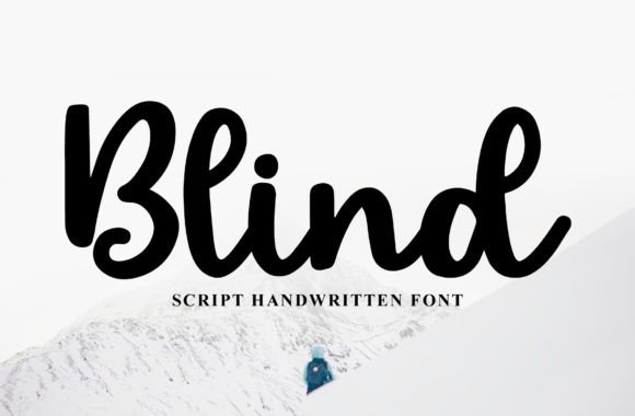
It started with a hero section. I was refining the homepage for a new coaching client—minimal layout, soft background image, clean spacing—and needed a headline font that whispered warmth without shouting. I loaded Blind, typed “Your Journey Starts Here,” and paused. Not because it looked unfinished—but because it felt *alive*. Like someone had just dipped a fine nib pen in ink and written it across the screen. That’s Blind: not just another script font, but a premium typeface from Script Amp that balances elegance with approachability, charm with clarity.
How Blind Performs in Real Web Layouts
I tested Blind across multiple contexts: a boutique online store’s banner, a course sales page headline, a portfolio site’s “About” intro, and even an email header. In every case, it held attention—not by being flashy, but by feeling intentional. Its strokes have gentle contrast and subtle variation, mimicking natural handwriting without sacrificing legibility at scale. On desktop, it shines at 48–72px for hero titles. At 32px, it remains highly readable as a section heading—even over textured or gradient backgrounds, thanks to its generous x-height and open counters.
On mobile? I resized aggressively. At 28px on iOS Safari, Blind still reads cleanly in headlines—no squinting, no confusion between similar characters like “a” and “o.” But I quickly learned its limits: below 20px, details soften, and swashes (which are optional, thank goodness) begin to blur. So I reserved it strictly for display use—never for body copy, navigation links, or form labels. That’s not a flaw; it’s smart typography discipline.
Where Blind Adds Quiet Authority
What surprised me most was how much trust Blind conveyed—especially on service-based sites. On the coaching site, pairing Blind with a neutral sans serif (Inter, set at 18px/1.6 line height) created instant visual hierarchy: the script said “human,” the sans said “reliable.” Customers didn’t just see words—they sensed care behind the design. Same with a small-batch ceramics brand’s product landing page: “Hand-Thrown in Portland” in Blind above high-res studio photos made the craftsmanship feel tangible, not abstract.
It works beautifully in digital ads and social banners too—where first impressions happen in under three seconds. Blind’s rhythm guides the eye naturally left-to-right, and its slight upward tilt gives even static text a sense of forward motion. No animation needed.
Practical Considerations for Web Designers
Before deploying Blind on a live site, I checked what came in the package: OTF, WOFF2, and variable font support (yes!), plus stylistic alternates and discretionary ligatures. The variable axis lets me fine-tune weight and width responsively—a huge win for adaptive headlines. Licensing is clearly commercial, covering client websites, SaaS dashboards, and digital templates—no surprises there.
For accessibility, I ran quick contrast checks: Blind passes AA at 32px+ on light or dark backgrounds when paired with sufficient spacing. But I never used it for UI elements requiring precision—like toggle labels or error messages—because its decorative nature belongs in expressive spaces, not functional ones.
One pro tip: always load Blind as a display font only. Use system or web-safe fallbacks (like -apple-system, BlinkMacSystemFont, 'Segoe UI') for body text. This keeps performance tight and ensures graceful degradation if the font fails to load.
Smart Pairings That Make Blind Shine
Blind doesn’t need competition—it needs context. My go-to pairings:
- A clean, geometric sans serif (like Poppins or Manrope) for body copy and buttons—creates balance between personality and practicality.
- A low-contrast serif (such as Lora or Cormorant Garamond) for editorial-style blogs or long-form pages—adds quiet sophistication without clashing.
- A second script—sparingly. I once layered Blind with a tighter, bolder script for logo lockups, using Blind for the tagline (“crafted with care”) and the other for the brand name. It worked because Blind’s softer energy softened the overall tone.
What doesn’t work? Pairing Blind with another high-contrast script, or stacking it with condensed fonts. It’s a lead vocalist—not a chorus member.
When to Reach for Blind (and When to Pause)
Reach for Blind when you want to signal authenticity, warmth, or artisanal quality—especially for brands rooted in storytelling, wellness, creativity, or handmade values. It excels in:
- Hero section headlines and subheads
- Call-to-action buttons (short phrases only: “Start Free Trial,” “Join the List”)
- Testimonial quotes and author bylines
- Digital brand kits (as primary display font)
- Landing page section dividers (“What You’ll Learn,” “Why It Works”)
Pause before using Blind for:
- Navigation menus or footer links
- Form fields, input labels, or error messages
- Long paragraphs or dense feature lists
- High-contrast accessibility-critical interfaces (e.g., medical or financial dashboards)
In those cases, its beauty becomes a barrier—not an asset.
Blind isn’t about ornamentation. It’s about intention. It reminds me—every time I use it—that great web typography doesn’t shout brand values; it embodies them. And in a digital landscape full of sameness, that kind of quiet distinction is worth every pixel.